Weaving Musings
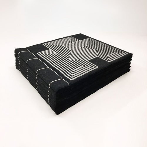
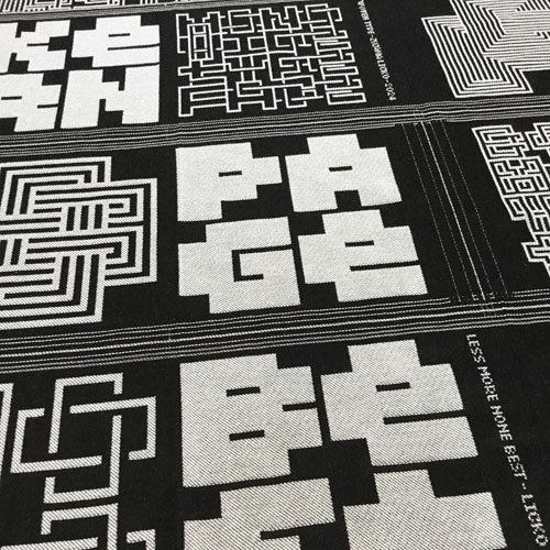
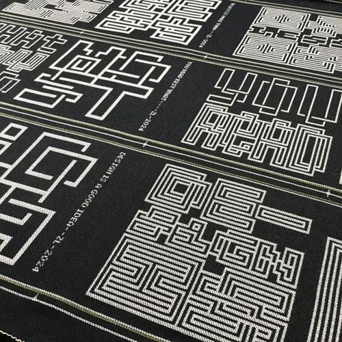
This series of book objects plays with type as abstraction, exploring the boundary between letterforms as pattern versus their legibility, inviting you to contemplate thoughts on design and reading. Each folio is made from jacquard woven fabric, featuring lettering that is taylored to the thread count. Hand sewn with Japanese four-hole binding, the result is soft and tactile, with a plush fringe at the top and bottom edges.
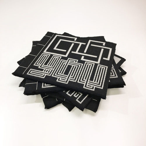
My background in bitmap font design gave me an instant connection to weaving structures. The lettering in these weavings is based on my earlier bitmap designs, which initiated the Emigre Fonts foundry, as a spin-off from Emigre Magazine, in 1985. Nearly 40 years later, this project has brought me full circle, back to the essence of bitmaps, employing them to weave text into textile.
By outlining and subtracting pixels, I came upon the illusion of woven forms, which inspired me to apply them to weaving technology, since weavings are essentially bitmaps, built from thread.
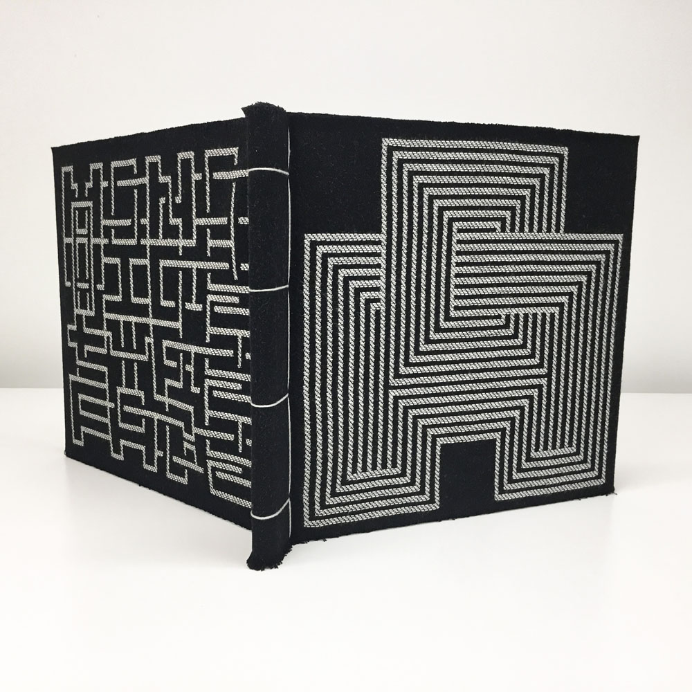
These monospaced letters fill their space entirely, both horizontally and vertically. When set without line spacing, their abstracted letterforms create dense patterns of text, connecting in both directions. Initially, I applied these woven letters onto pillows in four letter words like "NICE" and "WISH" which gave me the idea of the book format. To fit the square grid regimen of the book pages, I first limited the text to using just one, two, and four letter words. After the first book, I expanded this by adding three and five letter words, adjusting the fonts to fit the lettering at the 28 dpi resolution of the weaving threads. The square page format and monospaced font proportions both echo the square nature of the woven grid framework.
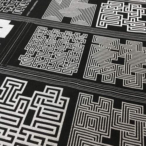
At first glance, some pages may read as line patterns, mazes, or diagrams of computer circuitry. But, be sure to take a closer look and discover the words within.
These folios are issued as numbered open editions:
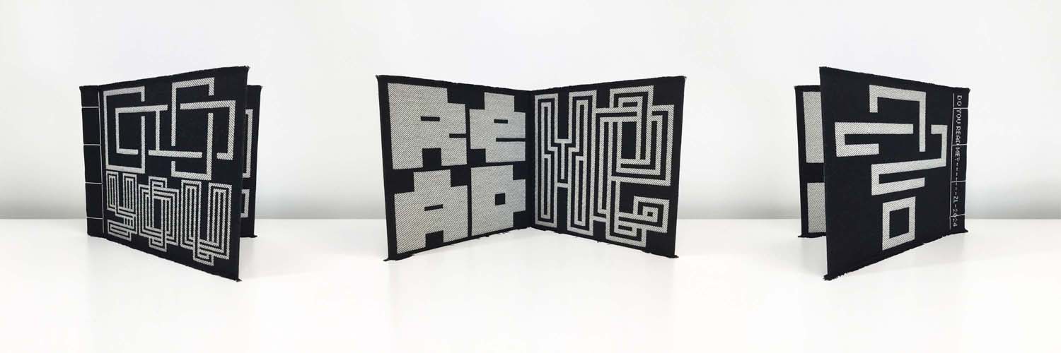
DO YOU READ ME? "Do You Read Me?" quote from Emigre Magazine No. 15. Four pages: 11.75 x 10.25 x 0.25 inches (30 x 26 x 0.8 cm) In the collection of: the Environmental Design Library, University of California at Berkeley 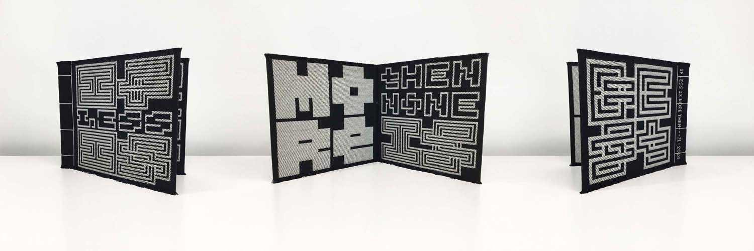
IF LESS IS MORE, THEN NONE IS BEST "Less is More" quote from Mies van der Rohe. Four pages: 11.75 x 10.25 x 0.25 inches (30 x 26 x 0.8 cm) In the collection of: the Environmental Design Library, University of California at Berkeley 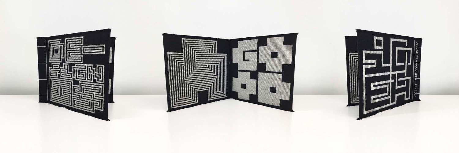
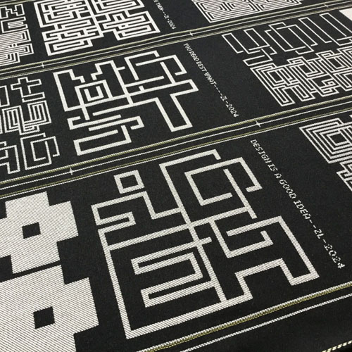
DESIGN IS A GOOD IDEA "Design is a Good Idea" quote from Rudy VanderLans. Four pages: 11.75 x 10.25 x 0.25 inches (30 x 26 x 0.8 cm) 
IF FORM FOLLOWS FUNCTION, THEN MAY THE FUNCTION BE PURE JOY OF FORM "Form Follows Function" quote from Louis Sullivan Six pages: 11.75 x 10.25 x 0.50 inches (30 x 26 x 1.2 cm) In the collection of: RIT Artists' Books collection, Rochester, NY 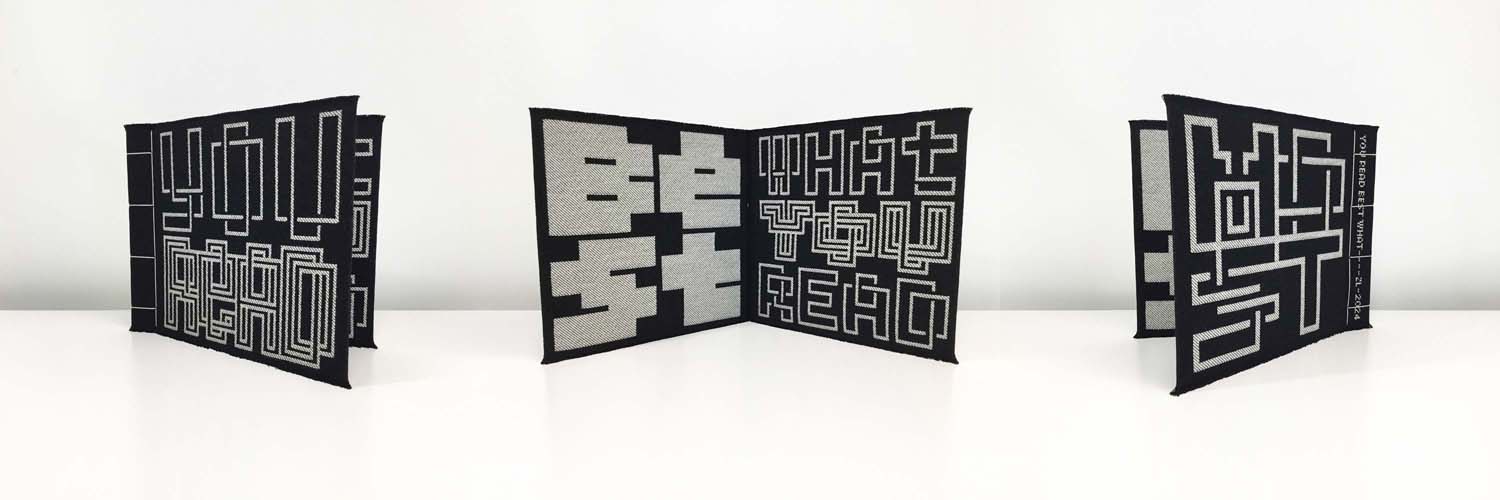
YOU READ BEST WHAT YOU READ MOST "You Read Best What You Read Most" quote from Zuzana Licko, deduced from the writings of Herbert Spencer. Four pages: 11.75 x 10.25 x 0.25 inches (30 x 26 x 0.8 cm) 
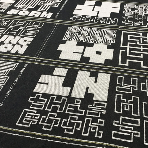
IN THIS BOOK YOU MAY SEE SOME HARD TO READ TYPE FORMS, UNTIL YOU DECODE THEM Six pages: 11.75 x 10.25 x 0.50 inches (30 x 26 x 1.2 cm) In the collection of: the Bancroft Library, University of California at Berkeley 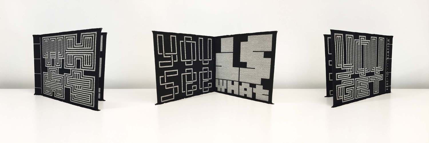
WHAT YOU SEE IS WHAT YOU GET This catchphrase, from 1970s and 80s popular culture, inspired the acronym WYSIWYG, for software that displays text in formatted preview. Four pages: 11.75 x 10.25 x 0.25 inches (30 x 26 x 0.8 cm) 
A SOFT 8 PAGE BOOK MADE WITH THIS ZERO KERN MONO WIDE TYPEFACE Eight pages: 11.75 x 10.25 x 0.75 inches (30 x 26 x 1.5 cm) In the collection of: the Bancroft Library, University of California at Berkeley Annotations: thoughts behind each of the musings. Read about the making process here. More about the font development: Lo-Res Lo-Res-Outlined Lo-Res-Monospaced Below: samples of the woven material, with the art in printer spread layout, showing the trim lines. 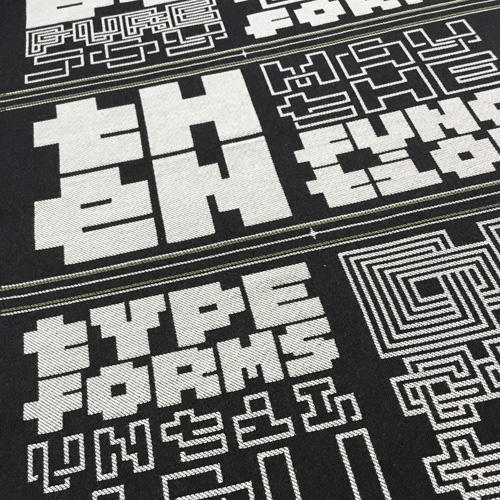
|